What do you first notice every time you see a new house? Is it the design or the colours?
Colours have the power to generate emotions and create lasting first impressions of a house. Isn’t it normal for people to identify you with the colour of your house? Didn’t you have that one neighbour who is highly associated with the colour of his house?
Welcome as we explore the psychology of colour in home styling and interior design. Let’s learn and master together how we can use colours to improve our house and life in general.
Story Stages
Understanding Color Psychology: Unlocking the Magic of Hues
Colours possess the ability to evoke emotions that significantly influence the atmosphere of any given space. It has the ability to communicate emotions without using any words or sounds. For generations, we have unconsciously used colours to signify our current dispositions. Take, for example, weddings where the bride is expected to wear white to represent purity and innocence. Over time, the colour white in a bride has been seen as a Christian value, signifying the purity and holiness of the union.
On the contrary, black is seen as a dark and even morbid colour. It is often associated with death and evil. When you see the colour black, who comes first in your mind? For sure, it’s not God. And that’s because black has been heavily associated with a negative connotation for so many years. In one research journal, it was said that in the prevalence of racial attitudes, a significant number of those associated with it are negative. Therefore, we have grown accustomed to relating black to evil and something dark. This is also the reason why you don’t often see a house painted in black.
Practical Tips for Applying Color Psychology: Dive Right In
Now, let’s go back to applying colours in our house. We’ve listed here a few tips to guide you on how to use colours that truly represent your personality.
- Accent Walls: Want to test the waters without committing fully? Create an accent wall with a bold colour. It’s like adding a dash of spice to your favourite dish—just enough to tickle your taste buds. If you’re feeling adventurous, consider using a trendy shade like “millennial pink” for that perfect touch of contemporary chicness. This could even be a fabulous opportunity to incorporate some stylish pink storage units or shelving to enhance both the aesthetics and functionality of your space.
- Furniture and Accessories: these are what bring your house to life. Frankly speaking, these are what make your house Instagrammable. With the right furniture and accessories that are colour-coordinated, it’ll make your house a cosy, warm home that you wouldn’t want to leave. It’ll be like your “staycationing” in your own home.
- Experiment and Personalize: Your house, your rules. Don’t mind what other people might think if you like red with green and a portrait of your Nana in the living room. No problem with that at all. For as long as you like living in your own house, then that’s perfect.
Mistakes to Avoid: Steer Clear of Color Catastrophes
Alright, if you’re not sure what you really want. We have a few tips up our sleeves to help you avoid any catastrophic use of colours.
- Don’t go overboard with one colour; balance is key. Find what colours work together and try to harmonize those colours in your home.
- Be mindful of cultural associations with colors; what’s lucky in one culture might be taboo in another.
- Don’t focus on trendy colours. Try to think if those trends will still look pleasing five years later. We do know that trends tend to change faster than lighting. Instead, find a classic choice that speaks to your personality.
If, unfortunately, you were unable to avoid these circumstances. There is a tendency for you to want to change the design of your home immediately after its completion. And that’s a waste of money and energy. So stay vigilant.
The Impact of Different Colors: Emotions at Your Fingertips
- Red: It’s the colour of intense emotions and power. In fact, red can actually speed up your heart rate and increase body temperature. That’s why we often associate red with fire even though the hottest kind of fire is the color blue.
- Blue: This is the colour of calmness. Whenever we see blue, we always think of peace and tranquillity. And so blue is perfect to be used in bedrooms where you can feel relaxed as you go to sleep.
- Yellow: If you want to infuse your space with sunshine and happiness, yellow is your go-to colour. Kitchens and playrooms will be beaming with life.
- Green: The colour of nature, green, promotes harmony and balance. It’s a natural fit for living rooms and home offices.
- Purple: Majestic and regal, purple evokes feelings of luxury and sophistication. Use it in bedrooms or as accent colours to make a statement.
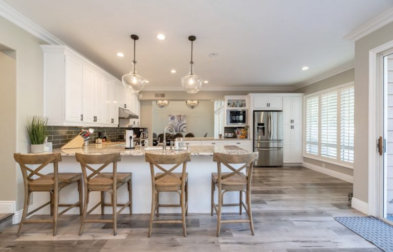
- Neutral Tones: Don’t underestimate the power of neutrals. Whites, greys, and beiges are versatile, creating a canvas for other colours to shine.
Like we said, don’t be scared to experiment. But if you’re hesitant to do the experiments yourself and you just want to save time and find the perfect palette on the first try, you can always seek the help of paint visualizers. These online programs will let you test-paint an entire wall using palettes of your choice. It’s a money-saving step that you can add to the process of designing your home.
Choosing the Right Colors for Your Home: A Splash of Expertise
Now that we’ve explored the depths of emotions, how do you go about selecting the colours for your home? It’s somewhat akin to choosing the ingredients for a recipe. You must take into account the atmosphere you wish to create and the purpose of each room.
Firstly, let’s discuss the impact of light. If your space is flooded with sunshine, you can opt for vibrant and daring colour choices. However, when dealing with smaller spaces, lighter shades can work wonders by creating an illusion of spaciousness.
Here’s the secret recipe: colour schemes. These serve as your instructions for crafting a pleasing environment. Whether you decide on complementary colour schemes, they all contribute to establishing a sense of harmony within your living space.
Staying Updated with Color Trends: Ride the Wave of Style
Absolutely, staying in the loop with ever-changing design trends is not just a smart move; it’s downright exciting! When you dive into the latest styles and home designs, it’s like embarking on a creative adventure. Think about it – you can scour the globe for palettes crafted by talented designers and then, like an artist with a fresh canvas, adapt those ideas to your home’s design. The best part? Picture the look on your friends’ faces when they visit your place and see how effortlessly chic and trendy your home has become. It’s the kind of transformation that sparks conversations and leaves everyone talking about your impeccable style.
Paint Your World with Emotion
Your house is essentially a canvas where you can express your emotions like an artist who uses colours. And now that you know the psychology of colours, you have the power to create masterpieces through your home styling and interior design.
Let every furniture in your home be a vivid symbol of your unique personality. Let the colours articulate precisely how you want the world to perceive you. All because your home is your sanctuary. It’s a place where you can shape an environment that resonates with your spirit and reflects your individuality. No one should be attached to your home more than yourself.
So, let your home be a testament to your creativity and a testament to the vibrant spectrum of emotions that make you, well, uniquely you.